 Along with television, newspaper, and radio, the internet is a platform for film promotion. Whether for a low-budget indie or studio blockbuster, motion picture websites are intricately constructed and often prepared months in advance of their theatrical release. These websites are endorsed in TV spots, trailers, and magazine ads along with the film. Why has online marketing become essential to the film industry? According to analysts at Pew Internet and American Life, the web is the outlet for approximately 73% of American adults or 147 million in the target “18-49” consumer age demographic, the group most likely to purchase a product. With this knowledge, a film can widen its possible target range through internet publicity. For promotion, exposure is a vital key to achieving box office success and studios are wise to pursue potential audiences considering the steady declination of moviegoers. A film site should firstly generate audience interest, but has the technological capacity to surpass the role of merely advertising. If constructed carefully, these sites can be an organic, informative web “community” that allows users to experience the world of a film within its cinematic text and through the film-making process.
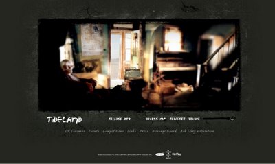
The website for Terry Gilliam’s fantasy/drama Tideland (2006) utilizes the available internet technology to draw online users into the film’s environment. Emphasizing interactivity and visual design, the Tideland site attempts to secure audience interest by creating a symbiotic relationship with visitors. Professionally successful, the site is a 2006 Movie/Film Webby Award nominee, one of only three film sites recognized for "excellence on the Internet" by the International Academy of Digital Arts and Sciences. The notice is quite significant considering more than three hundred films are released every year with accompanying websites. Likewise, it is an online accomplishment to be a “Movie/Film” contender as a Webby Award is considered “the Internet's most respected symbol of success.” The site deserves acknowledgment for its brilliant showcase of the aesthetics and themes of Tideland compared to the usual, banal online advertising. The site is promotionally successful because observers are provided with a creative experience that is arguably more interactive than the film itself.

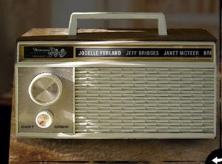
The fundamental facet to every film site is captivation; they must intrigue visitors to the extent that they will tell others about the film and ultimately watch it in theaters. Site-building page Web Style Guide indicates, "[Entertainment] audiences need to be grabbed immediately...or they'll hop somewhere else in search of stimulation." Tideland especially follows the suggestion by pulling audiences into an virtual atmosphere that requires interactive participation. Upon entering the site, a haunting, stop-motion introduction video grabs visual attention while revealing the protagonist of Tideland and its aesthetics. The lead-in merges into a total Macromedia Flash environment that encompasses film information within embedded links.  Following the criteria for Webby Awards, the site “communicates a visual experience and may even take your breath away,” a specification for the “visual design” category. Indeed, visitors explore by engaging graphic links like an old radio or a dead tree that reveal cast information and behind-the-scenes video clips respectively. A contrast to common online realms, observers can use the mouse to virtually move within the intriguing surroundings. Brief visuals independently appear and provide surprising moments for participants. On “The Attic” page, a disturbing image of a monster appears from the shadows. It is impressive given that users have no control regarding its appearance.
 Importantly, the range of interplay and the visuals themselves are centered in the content of Tideland. The monster is a “Bog man,” the villain of Tideland as shown in the clip “Prosthetics Team – Caligari” on the “Field of Dreams” page. Therefore, the lack of interaction with the “Bog man” is meant to produce awareness and possibly fear of the uncontrollable entity, mirroring its film role. With the exploratory freedom, prospective audiences become interested in the movie through virtual connection.
Internet technology has the ability to showcase film in ways impossible to accomplish in any other advertising medium. Webby Awards describes, "interactive [elements are] what separates the web from other media. Their inclusion should make it clear that you aren't reading a magazine or watching TV anymore." Seemingly, the site prevails because it attract users to the film more than the film could have possibly achieve alone. T o explicate, moviegoers are usually placed outside the film as third party participants. This is not to say audiences remain objective as they may connect with characters emotionally or visually through point-of-view (POV) shots. However, the website for Tideland allows audiences to virtually
  become the protagonist Jeliza-Rose. Pop-up, interactive doll heads encourage investigation of the atmosphere, addressing visitors with interjections like, “Let’s go outside Jeliza-Rose!” The film trailer and synopsis reveal the doll heads as the faithful companions in her journey and likewise, the accompaniment of online visitors. Within the surroundings, users literally share the POV of Jeliza-Rose as established by screenshots from the film. The site clearly “has a voice, a point of view” as praised by Webby Awards and additionally, “always leaves you wanting more.” The latter criteria is best represented on “The Railroad” page where online audiences are placed directly in front of a train in suspended animation. With virtual movement constricted,
 spectators are left wondering whether Jeliza-Rose safely moves off the tracks in the film. When placed in her shoes, viewers become unique participants in the world of Tideland. However, the site keeps visitors adequately surprised and bedazzled so that viewers will have to see the theatrical release to have all their questions answered.
Ingeniously, the element of discovery ties into Tideland’s theme of adolescent journey as Jeliza-Rose acclimates to her new surroundings through an imaginative adventure. According to Webby Awards, websites should “allow you, as a user, to give and receive. It insists that you participate, not spectate.” For Tideland, the website develops a beautiful ambiance that creatively simulates locations of the film. Online audiences discover the world of Jeliza-Rose while she “escapes the vast loneliness of her new home into the fantasy world that exists in her imagination,” as described by the synopsis. Visitors journey through five main pages: the Farmhouse, the Attic, the Railroad, Dell’s house, and Field of Dreams. Each page mirrors actual film locations as evidenced by production stills from “The Attic” and videos from “Field of Dreams” pages. Significantly, the site also provides aural stimulation to create a more visceral surrounding for audiences. Each page showcases different sound environments depending on the presented visuals. On the “The Farmhouse” page, the sound design matches the visuals of a woman rocking a creaky chair and hints at a world beyond the front porch with the faint bird tweets. Also, the haunting, melodic score for Tideland plays consonantly on all the pages, creating an interesting mood for the site as well as reflecting the film. This atmosphere allows the audience to gain a familiarity and closeness with the film that could not be achieved in 30-second TV spot or magazine ad.
Though the website for Tideland is technological savvy, key material is relatively easy to locate. Besides the aforementioned interactive aspects, the site offers different avenues for visitors who desire immediate access to film facts, extra media, or text materials. Following Web Style Guide, the site offers visual and text-based pages so varying audiences can participate and access the same facts on the website in alternative ways. Below the flash program, text links open separate windows that contain basic film information like international release dates, press images, and UK theater listings.
 Clearly labeled, the links are located in the most advantageous area as natural eye motion moves down and to the right. For the non-exploratory user, the “access map” link reveals a graphic map of the five virtual environments with direct links to their interactive content. Moreover, Web Style Guide indicates,
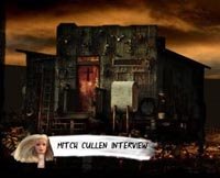
  “Your users should feel comfortable exploring your site and confident that they can find what they need.” Likewise, the access map has content distinctly labeled as “Stills Gallery” or “Terry Gilliam Interview,” minimizing possible confusion about their location. Some users may be disappointed at the lack of a fully text version of the entire site. However, general navigation to content areas is relatively simple even for those without advanced technological knowledge. While the site’s structure accommodates different sensibilities, clearly the creators prefer visitors to interactively participate since great effort was made creating the Flash world.
Like most film sites, Tideland presents additional material like exclusive film clips, behind-the-scenes videos, and PDF files of production notes. This emphasis on media can be potentially risky since long download times,  low quality video, and assorted technical problems can disrupt user experience. Media frustration may explain why only about 56% of the internet population go online to watch videos. However, the site artistically displays content by integrating high quality media with efficient, automatic download into the flash program. Visitors are spared from technological hassle all media is under the Macromedia Flash platform. The clips can sustain audience attention because they only last approximately thirty seconds to two minutes. This translates to great functionality because the site places “the experience center stage and the technology invisible.” Regarding content, the segments reveal the “film-making” side of Tideland featuring interviews with the wardrobe supervisor, the art director, and the gaffer as well as “on location” videos. Webby Awards stresses that site content “be engaging [and] relevant” for visitors. With success, the media on the site is appealing, but the most charming feature is “Postcards from Tideland.” In place of lengthy clips, the page presents an animated, out-of-tune player piano that “plays” music while featuring various behind-the-scenes
 clips where the music roll is typically located. On "Dell's House" page, there are relevant videos from director Terry Gilliam and Tideland author Mitch Cullin. The clips of Gilliam deliver insight into the mind that shaped the film and therefore the website. In one of the segments, Cullin endorses the film, remarking, “I trust [Gilliam’s] aesthetic far more than my own.” This encouragement establishes credibility for both the film and site. These bonus features are entertaining and meaningful, yet distinguish the site since the bonus material will not be shown in theatrical versions and may not be placed on the DVD release.
It is important to that the site content continually addresses a target audience. Though the synopsis reads “Tideland is a celebration of the power of a child’s imagination,” it is clear the site and film are meant for older audiences.  Even with a young protagonist, Tideland is unsuitable for children because of the drug use aspect and possibly frightening imagery. Likewise, the site itself is inappropriate as a syringe filling with blood acts as the transition from page to page. Most young children could not appreciate the sophisticated web environment or have the patience to smoothly navigate through it. Additionally, the responses on the message board show a level of maturity and film knowledge not attributed to small children or even average film goers. Unlike most message boards, this responses contain deep film analysis or discussion of Gilliam's past work. Like Tideland, the site is aimed at a niche market rather than a mass audience. On the Q & A page, Gilliam explains, “With Tideland, one can deal with dark and disturbing subject matter, because we are not appealing to a big audience.” Instead, the target viewers fall into three categories: fans of previous Gilliam films, followers of the fantasy/cult genre, and audiences from the United Kingdom.
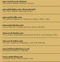
  The "Links" pop-up window provides links to Gilliam fan sites like Dreams and sites dedicated to Monty Python, arguably Gilliam's most popular work. Other links correspond with the fantasy genre and cult cinema, both of which many films of Gilliam fall under. Tideland and its site especially aim for the moviegoers in UK, because they have a historical fan base with Gilliam and his work. This may account for Tideland being first released in the UK. Furthermore, the "UK Cinema" link provides a long list of UK theater houses that will feature the film. While American moviegoers may feel excluded, it is wise to appeal to the UK audiences as they have repeatedly supported and watched Gilliam films in the past. Some may argue against catering to specific audiences rather than mass appeal because the latter may mean a large box-office revenue. But given Tideland's subject matter, it is smarter marketing to appeal to a smaller, sure-fire group rather than risk time and money banking on the uncertain revenue of a mass audience.
Due to the exceptional nature of the site, there are minor, problematic areas that should be adjusted to make a more seamless, user-friendly site. Their web environment is so unique that the various difficulties need be fixed so there is no detraction. Web Style Guide argues, “Repetition…gives your site a consistent graphic identity that creates and then reinforces a distinct sense of “place” and makes your site memorable.” The main problem seems to maintaining consistency throughout the pages. Some are more interactive than others and this inequality could manifest into possible boredom for users. There are several clips that have comparatively low quality video and sound. At least one media clip wouldn’t load from “Field of Dreams” page, lessening the overall user experience. Often, the Tideland score abruptly shut off when certain videos played and volume problems became distracting. Changes to the structure will only improve interactivity like eliminating unnecessary links like the wall on the “Piano” page. Surprisingly, some areas are outdated, like a finished publicity contest, and should be removed to avoid confusion for visitors. Most important, there is no information or links about the creators of the site which raises questions of credibility. This aspect needs to be addressed even though the site provided credible sources for the film. While these are relatively minor details, these awkward areas may glaringly stand out to visitors, because the overall website is extremely well-crafted. If these areas are reconsidered, the site will be ultimately stronger and possibly more effective to audiences.
Overall, the Tideland website has creatively presented and promoted the upcoming film with an engaging, beautifully-designed environment. The interactive freedom allows for a deeper connection between the movie and web community, hopefully persuading audiences to theaters. Internet technology was utilized to transform a basic marketing site into a fully-fledged virtual atmosphere. Users even have the opportunity to explore the world offline. A downloadable screensaver mirrors the site as described, “Enter the world of Tideland with this atmospheric screensaver, where surprises lie waiting in every corner.”  The site has become more intricate and informative as the release date for Tideland approached, providing more clips and a Q&A section with Gilliam and online visitors. Additionally, the promise of promotional prizes and updates along with an open forum of discussion offers audiences a enticing reason to come back. According to the Way Back Machine, the site has been progressing and making additions since its creation in 2005, proving its viability as an organic, ongoing experience for visitors. Regarding Tideland, Terry Gilliam remarks, “I hope people are surprised, confused, delighted, and moved”—a feat dually accomplished by the online atmosphere. Successfully, the website for Tideland offers a unique experience and incentives to prospective moviegoers that work to forge a sustaining attachment to the film.

